
UNDERDOG
Underdog was an online publication dedicated to niche interests and communities based in the Philippines.
Visual Branding
2019
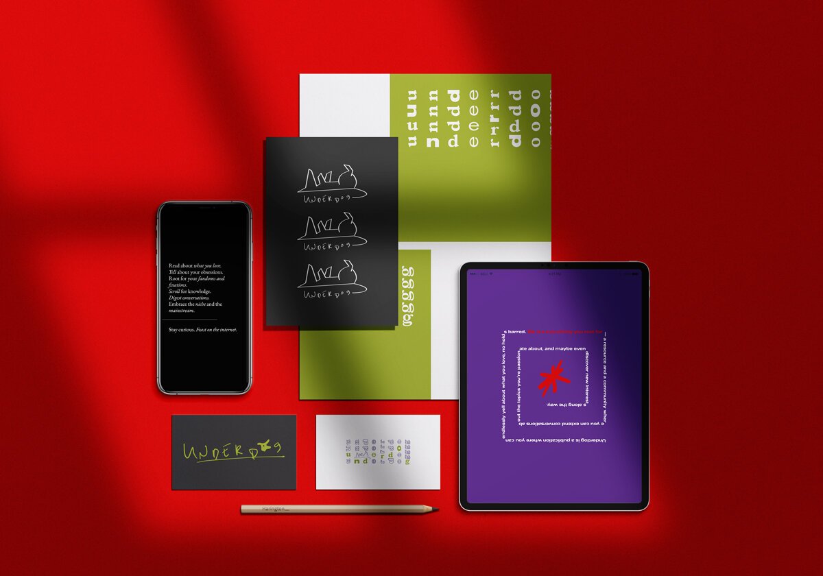

“Scream your heart out. Underdog is the home of your obsessions and fixations. Scroll for knowledge, root for your fandoms—no holds barred. Created for your interest only.”


PERSONAL • LOUD • DISTINCT
The visual direction for Underdog was developed during a time when sleek, minimalist aesthetics reigned supreme. What we hoped to achieve with the brand was a more organic, almost haphazard feel—as frenzied, and messy, and colourful as a wall of posters owned by the ultimate fan girl.
I created a custom font using my non-dominant hand to lean into the mess of it all and paired this font with two other typefaces that held a lot of personality.
Jet Black was our main colour for all bases and pages, again going against the grain at the time of conceptualization. Bright colours like green, purple, and red made up the rest of the brand palette.
Recommended imagery revolved around packed images and analog collages.
